In my science blogging workshops, many participants are genuinely surprised by their very last chapter. Most assume that science blogging includes solely the writing-publishing workflow. Yet, running a science blog needs a few more tasks and reflections so that people are motivated to come back to your posts to learn more about the science.
Just because someone has landed on your website and started reading a post doesn’t mean they will believe the information in that post. They need to understand who is behind the blog, where the scientific information comes from and how the author distinguishes evidence from interpretation.
A recognisable design, clear article structure and language they can follow are also important signposts for readers of a high-quality science blog. All of these elements together make up the branding of the science blog.
What is science blog branding?
Our readers are overwhelmed by the content online. So, for someone to choose your science blog over all the websites, blogs, companies, influencers and organisations online, they need to not only recognise it but also be encouraged to read your posts.
This is what they call branding: everything a reader perceives related to your science blog. It includes all elements related to how the reader sees and remembers your blog: including the language and wording, the website and article structure, content quality, design and colours.
I agree that branding seems overwhelming at first; it involves many factors and elements. Here, we will look at the most obvious ones that help your reader recognise your science blog, starting with what you might first think of when hearing the word branding.
Visual elements to make your science blog consistent
The first things that may come to mind are probably the colours of your science blog. Choose one minimal set of colours that reflect the theme of your topic, no more than five or six. One of them should be the text colour and one the designated highlight colour that you use sparingly.
Use these colours everywhere:
- In all text and design elements on your website
- In all graphics and illustrations
- In all buttons
- In all social media images
- In the logo
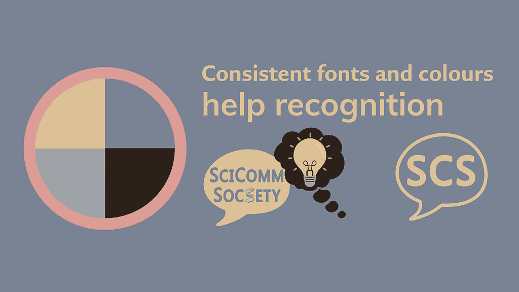
The logo of your website represents what your science blog is about. You may want to include some part of the blog’s name or tagline. It should also be recognisable, using the branding colours.
Choose designated fonts for your website, graphics and social media images; sans serif fonts are generally easier on the eye. Pick one font and one font size for blog post titles, subtitles and body text, and ensure they remain legible on mobile devices.
Your post structure should also be consistent. Here, take into account:
- The rough length of blog posts
- The amount of white space between paragraphs as well as subtitles and text
- The length of sentences, paragraphs, subtitles and sections
Use consistent writing and language
Branding is also about the written elements; basically how you write. This includes:
- Grammar
- Spelling
- Punctuation, for example the Oxford comma
- Use of American or British English
Some of these require some decisions from you: which way to write or which punctuation you want to use. There is no wrong decision, but once you have decided, apply your choice throughout the blog.
The same is true for scientific terms and jargon. Use terms, phrases and abbreviations that make sense to your target audience and that they understand. Be consistent with them and don’t be afraid of repeating the same phrases, terms or analogies on your website. Using the same terms consistently can help readers recognise your style and follow your scientific explanations.
Also reflect early on which voice you want to use on your science blog. Choose one that works for you naturally without having to force it. Again, there is nothing wrong if you decide to sound professional, conversational, humorous or formal. Just be consistent throughout.
Illustrate your science in an accessible way
Your visual branding is not just about design and language. It also includes explaining science through visuals clearly and accessibly.
Scientific illustrations often show complex concepts or processes in one overwhelming figure. For science blogs, however, it is good practice to create a series of visuals to help readers learn. When describing one part of a complex scientific process or concept, add one visual, graphic, illustration or comic showing that very part. This helps the reader imagine one piece of the concept at a time before comprehending it entirely.
A clear and engaging visual also needs to be accessible. Our science blogs should help everyone understand science, including visually impaired people. Hence, when creating visuals, make sure you:
- Convey only clear message without adding too many details
- Use high contrast between background and shapes or text; sometimes adding a high-contrast border makes it more explicit
- Use different shapes and colours to distinguish between different components
- In the text, mention the shape and colour the components have in the visual
- Avoid using red and green elements together
- Use a sufficient amount of white space
- Use as little text as necessary; instead, have your text body carry the explanation
- Use the same words and terms as in the text so readers can easily understand what each component in the visual represents
- Add alt text that conveys the image’s relevant information
Accurate and relatable scientific content matters most
While design and format give a first impression of your blog, they should support the science, not make it louder or more dramatic. The reader came to your blog for the science, so give them evidence-based and transparent explanations. Also, link to the original scientific sources, preferably to open access articles.
When explaining a scientific topic or concept, say clearly what is scientific evidence, what may be inferred and what is your opinion. Distinguishing these helps people trust what they read.
Explain the uncertainty in a scientific study or whether there are caveats or limitations to it. Similarly, don’t overstate scientific findings and be transparent about missing controls or unconvincing results. By admitting that not everything is perfect in the scientific world, you present yourself as a human, and thus, more trustworthy science communicator.
Show the human side of science
We as scientists are humans. Showing your reader the human side of science gives them a clearer sense of who is behind the blog, what motivates you and what expertise you have on the topic.
You can bring personality into your blog by telling your story. If you have a personal anecdote related to a scientific concept, tell it. For example, you may be struggling to understand a scientific detail or are utterly fascinated by a concept or an organism.
This also includes explaining your motivation on an about page. Introduce not only yourself, but also tell your story, where you’re coming from, your expertise and passion for science communication. Where it makes sense, weave these parts into posts by showing your uncertainty, vulnerability, humour, expertise or fascination for a topic.
Using AI tools to establish branding guidelines for your science blog
While you as a science blogger have to decide how you want your posts to sound and feel, AI tools can help you put these decisions into guidelines. For this, I recommend writing and publishing at least a handful of posts to establish what your voice and brand could be like.
Then, use an AI tool, any one you prefer, and have it analyse your posts. Tell it to check:
- the overall voice of the posts
- the general post structure
- sentence, section, subtitle and paragraph length and structure
- scientific terms, jargon and phrases you consistently use
- notes on punctuation, spelling, grammar, abbreviations
- any other consistent highlights that may make your blog posts unique
Study that analysis to understand your own writing. Reflect on whether this is what you want to achieve and even discuss with the tool what works and what may need improvement.
Rewrite this analysis into branding guidelines for your blog. Rely on these for future posts or share them with guest bloggers so they know how to write for your blog. You can even ask an AI tool to quality check future drafts against your guidelines to ensure consistency.
Two notes here, though: Even though AI may give you its opinion and ideas for improvement, everything remains your decision. It is your blog, so don’t let a machine tell you how to write and sound.
Second, your guidelines may change with time and that is completely fine. As you learn, your blog will evolve. So will your writing and your idea of what works and what doesn’t. So, don’t stay married to guidelines you set at the beginning just because this is what you knew best back then.
Help people get science with consistent blog branding
In summary, to encourage readers to visit your blog, branding does not need to make your blog louder or more dramatic. The idea is to give readers a consistent way to recognise your blog, find their way through your posts and follow your scientific explanations.
Keep your visual elements, post structure and language consistent. Alongside design elements, show where your information comes from, distinguish evidence from interpretation and explain uncertain results.
Start by documenting these decisions in guidelines for your blog. Include your colours and fonts, writing and language preferences, how to link to scientific studies and your approach to accessible visuals. Use it as a reference, then update it as your blog grows.
Over time, these consistent decisions become your brand, your blog’s identity. Ultimately, readers get used to your voice, articles and explanations, while transparent sourcing helps them evaluate the science you explain.